Colors
The brand colors red and white form the visual heart of the appearance. They stand for an innovative, dynamic and progressive character – they also reflect the history of the brand and communicate reliability and partnership.
The primary colors define the character of the brand. They are used consistently in all media and applications, in particular in elements with high visibility and external impact.
The color system is supplemented with structuring accent colors. These support the visual order, increase differentiation between functional levels and provide clarity in complex layouts.

Use of primary colors
The primary colors red and white dominate the brand perception significantly. The interplay between these two colors is key for the visual identity and recognition in all communication media.

Use of the structuring colors
Gray scales may be used as fill colors in addition to red and white and enable content to be structured. These fill colors may be used for backgrounds on entire pages, sections of pages and information boxes.
Use of the secondary colors
The accent colors supplement the color palette for information graphics. These colors are used sparingly and may not be used for backgrounds or larger areas to ensure that the overall impression of the brand is red and white at all times.
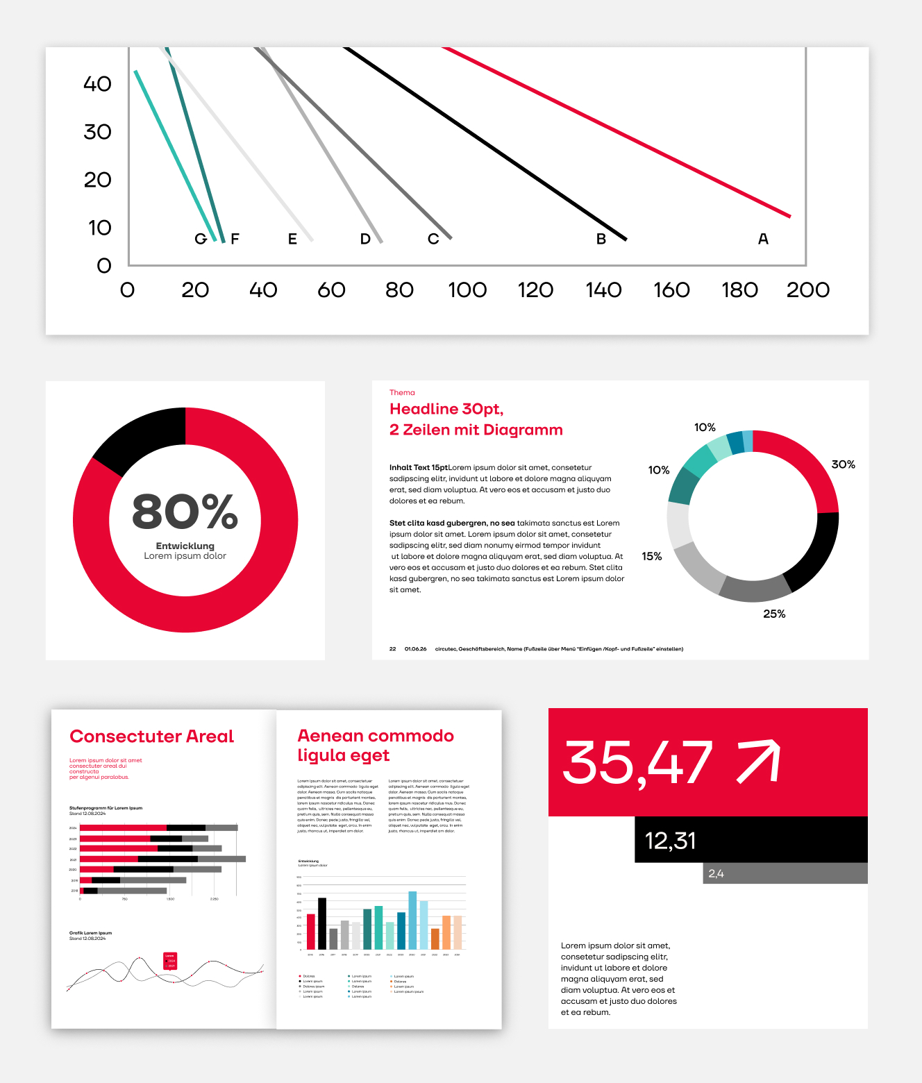
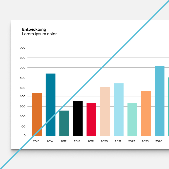
Colors for information graphics
Where necessary, the other accent colors can supplement the primary colors for information graphics. Red is always the first component of the graphic, followed by black.
If other colors are required, the colors are used in the following order and scales: Gray, teal, blue and orange.
Color codes
Our brand-specific color values are the key to ensuring a uniform appearance. They are used in different formats such as CMYK, RGB, HEX and Pantone to guarantee consistency across all media.
Primary colors
Red
HEX #E70633
RGB 231 / 6 / 51
CMYK 0 / 99 / 75 / 0
Pantone 1795 C
RAL 3020 Verkehrsrot
White
HEX #FFFFFF
RGB 255 / 255 / 255
CMYK 0 / 0 / 0 / 0
Black
HEX #000000
RGB 0 / 0 / 0
CMYK X / X / X / 100
Pantone Black C
Structuring colors
Gray 01
HEX #333333
RGB 51 / 51 / 51
CMYK 0 / 0 / 0 / 80
Pantone Cool Gray 11 C
Gray 02
HEX #737373
RGB 115 / 115 / 115
CMYK 0 / 0 / 0 / 55
Pantone Cool Gray 8 C
Gray 03
HEX #B3B3B3
RGB 179 / 179 / 179
CMYK 0 / 0 / 0 / 30
Pantone Cool Gray 4 C
Gray 04
HEX #E6E6E6
RGB 230 / 230 / 230
CMYK 0 / 0 / 0 / 10
Pantone Cool Gray 2 C
Gray 05
HEX #F2F2F2
RGB 242 / 242 / 242
CMYK 0 / 0 / 0 / 5
Pantone Cool Gray 1 C
Secondary colors
Gray 02
HEX #737373
RGB 115 / 115 / 115
CMYK 0 / 0 / 0 / 55
Gray 03
HEX #B3B3B3
RGB 179 / 179 / 179
CMYK 0 / 0 / 0 / 30
Gray 04
HEX #E6E6E6
RGB 230 / 230 / 230
CMYK 0 / 0 / 0 / 10
Teal 01
HEX #26807D
RGB 38 / 128 / 125
CMYK 70 / 0 / 2 / 50
Teal 02
HEX #2FBDAE
RGB 47 / 189 / 174
CMYK 75 / 0 / 8 / 26
Teal 03
HEX #96E3D4
RGB 150 / 227 / 212
CMYK 34 / 0 / 7 / 11
Blue 01
HEX #007E9E
RGB 0 / 126 / 158
CMYK 100 / 20 / 0 / 38
Blue 02
HEX #5DC0D9
RGB 93 / 192 / 217
CMYK 57 / 12 / 0 / 15
Blue 03
HEX #A1E1F0
RGB 161 / 225 / 240
CMYK 33 / 6 / 0 / 6
Orange 01
HEX #DE722A
RGB 222 / 114 / 42
CMYK 0 / 49 / 81 / 13
Orange 02
HEX #FCA367
RGB 252 / 163 / 103
CMYK 0 / 35 / 59 / 1
Orange 03
HEX #F5D2BA
RGB 245 / 210/ 186
CMYK 0 / 14 / 24 / 4
Colors don’ts
Do not use colors, gradients or shadings that are not part of our defined brand palette. Different color shades detract from the consistency of our visual identity. Also avoid extremely low-contrast combinations that impair legibility or accessibility.

The secondary colors are not used as a font color.

The secondary colors are not used as background colors.
Do not change the color sequence for graphics.
FAQ
In our FAQ area, you will find answers to the most important questions relating to the implementation of our brand guidelines. Here you will receive fast and practical support for a consistent brand communication.
Our brand palette includes the primary colors red, white and black, as well as structuring colors in gray. We also have a palette of gray, teal, blue and orange as secondary colors, which are used for diagrams. These colors represent our brand and contribute to our visual consistency.
Primary colors are used for the majority of the visual communication, such as for logos, font and important background colors. Secondary colors can be used for information graphics. The gray shades can be used for structuring content and as a background color.
No, to date, there have been no additional color variants that may be used as part of an extended brand palette for specific seasonal promotions or special projects.
Adequate contrasts must be used to ensure accessibility, in particular between text and backgrounds. These contrasts should correspond to the current standards and be accessible for all target groups.