Layout principle
Circutec – Driven by progress.
Inspired by practice – by pumps and employees, who deliver top performance under pressure – we have developed a layout system that transfers these principles to the design.
An intuitive system that withstands all requirements and makes pressure visible like a barometer.
Grid system
The grid system forms the structural basis of the entire design concept. It is derived directly from the logo and ensures that all elements are positioned consistently, in balance and in line with the brand image.
The starting point for defining the grid is the calculation of the logo size - this is based on the format diagonal and ensures flexible scaling across all media (for details, see the chapter "Basic elements > Logo").
This approach means that the grid principle can be used whatever the concrete end format.
The next step is to calculate the type area from the logo size: This corresponds to one logo height all around (without protected zone).
The format is then divided into grid units, both edges are divided into six columns of equal size.
The grid should not be seen as a rigid construct, but as a flexible system for ordering content that provides orientation without restricting design freedom. This applies for both static and dynamic layouts.
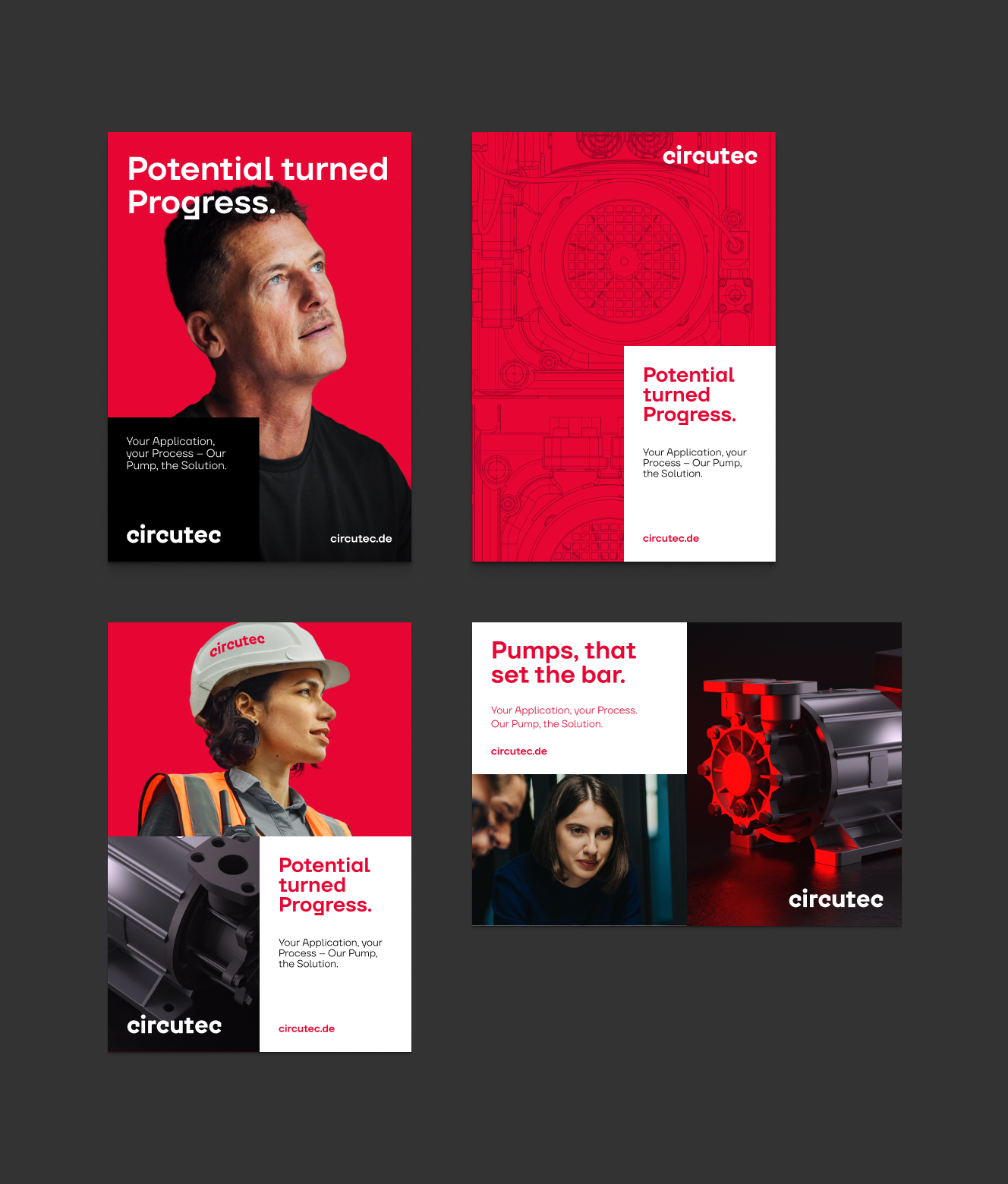
Area principle
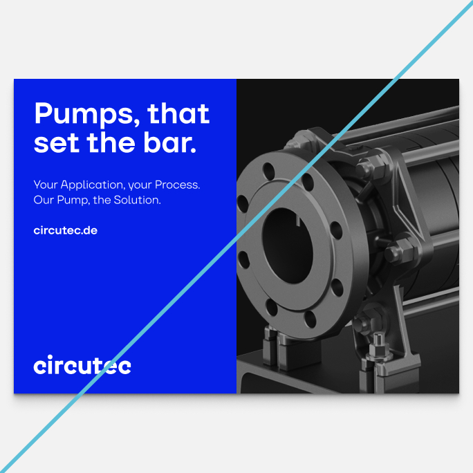
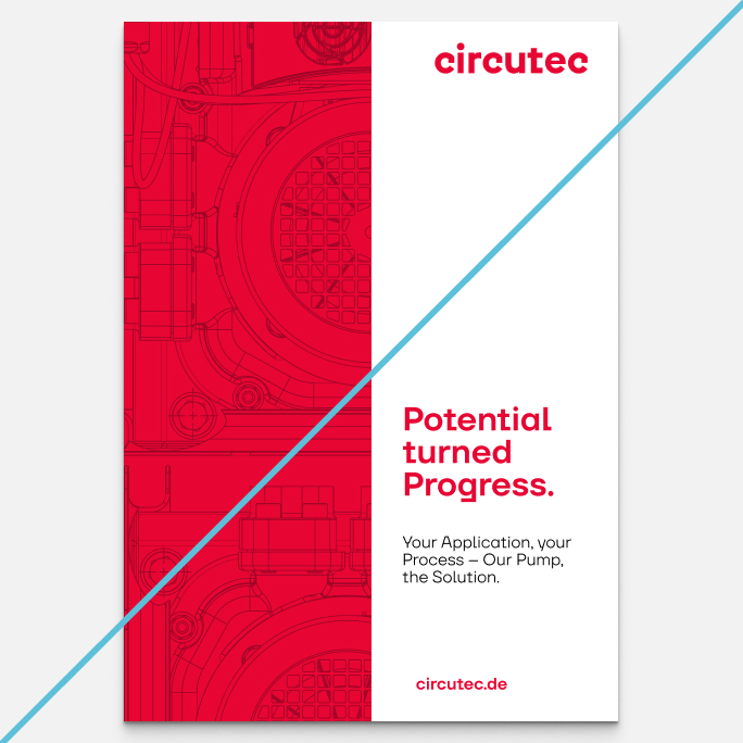
The format can be filled with content in a targeted way based on the grid. Here, areas are based consistently on the grid lines of the long edge and can be designed in red, white or with image material.
The layout is always built up from the short edge.
The division of the long edge must never make up more than 50 % of the format.
Texts are positioned on the areas so that optimal legibility and a clear information structure are guaranteed.
Depending on the use, the color of the areas can be controlled so that the layouts appear more factual (large proportion of white) or emotional (large proportion of red).
Areas in portrait format
Portrait formats can be divided in the horizontal plane in six equal stages. The user is free to choose whether the resulting areas are filled with color or image material.
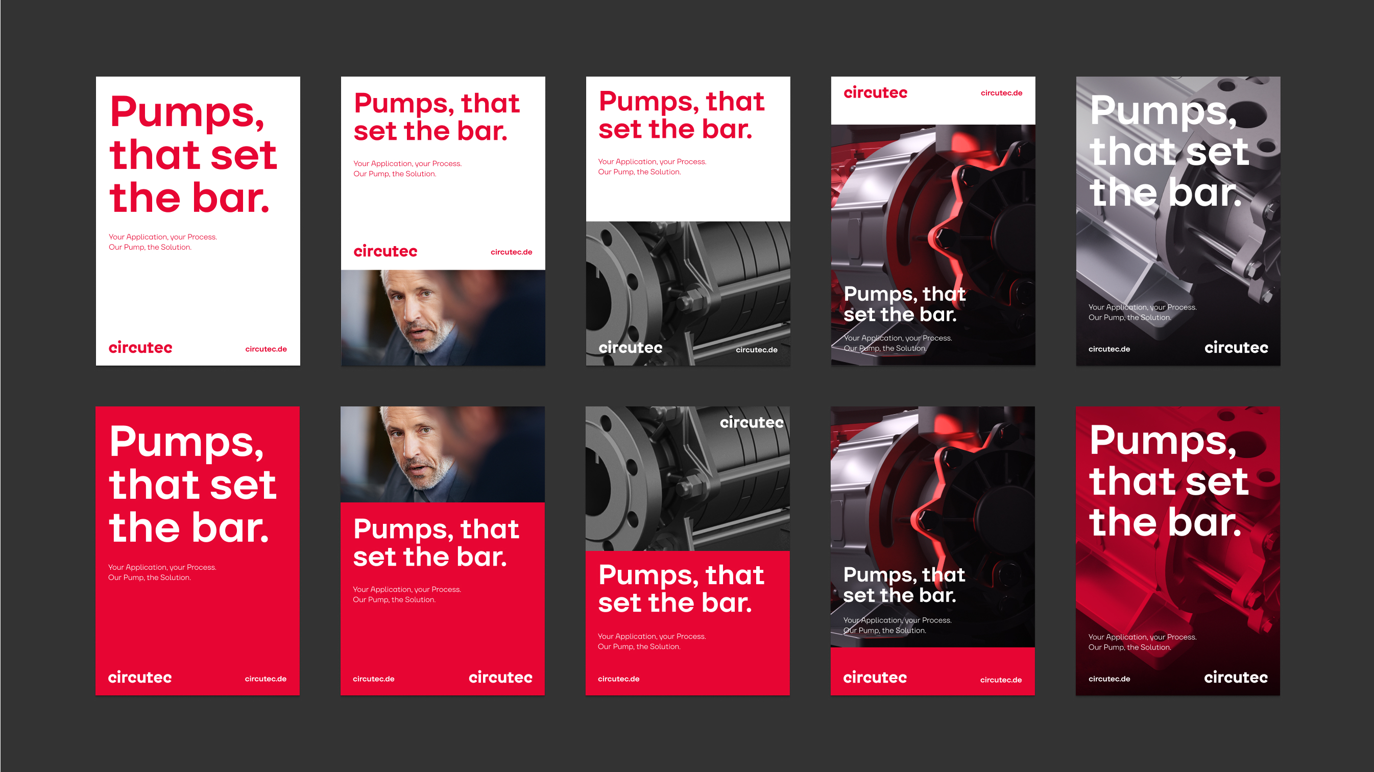
Areas in landscape mode
In landscape mode, the division takes place vertically. To avoid unusable areas, the following subdivisions are permitted here: 1/3, 1/2, 2/3 and 1/1. Here too, the user is free to choose whether the resulting areas are filled with color or image material.
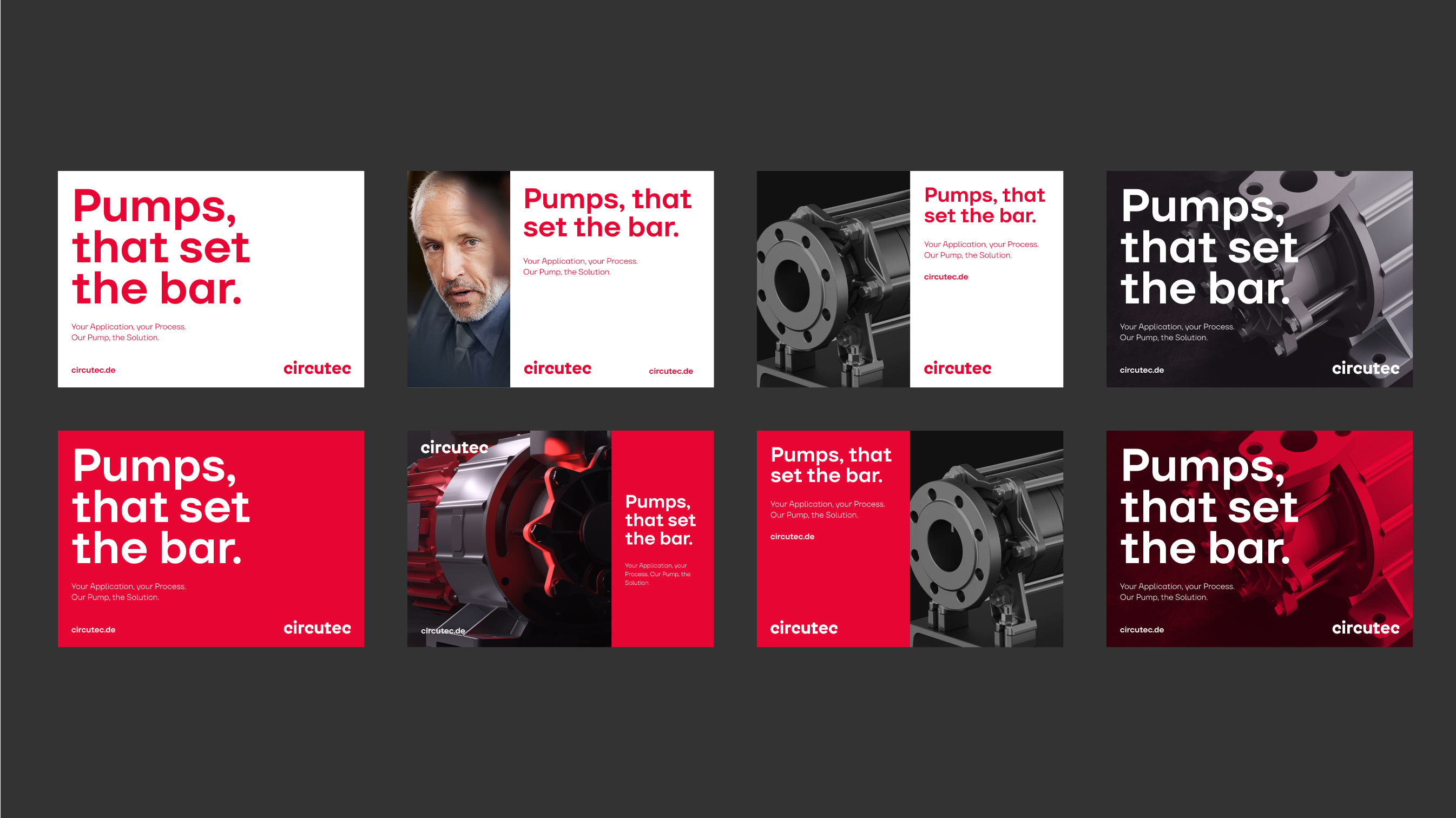
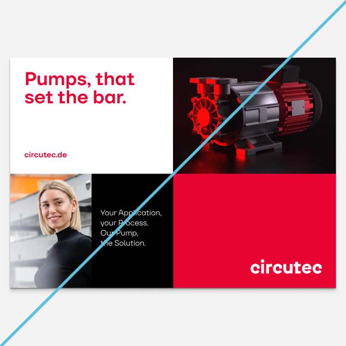
Flexible area division
A third area can be added to the system, which subdivides the layout further.
This creates more design flexibility:
It enables multiple images to be used within a layout and also improves the structuring of the content.
Text content can also be positioned on calm areas in a targeted way, without cropping the image material excessively.
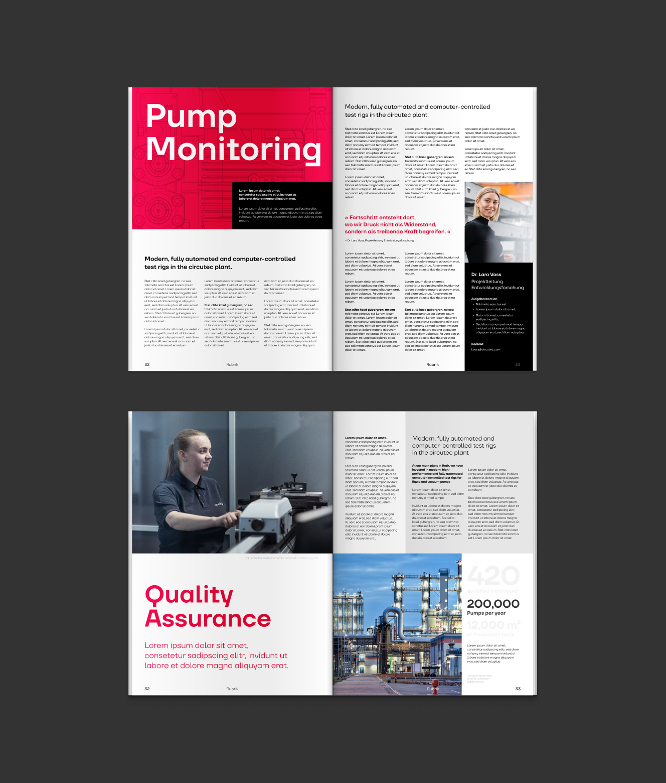
Inner pages
Inner pages are also based on the 6-point grid.
Areas can be designed more freely here, however, to present content in a clear and visually appealing way.
Structuring colors may also be used as fill colors on inner pages.
Layout don’ts
It is important to comply with the specified layout guidelines to ensure a clear, uniform brand perception. These guidelines provide the necessary framework for a professional design. Unauthorized adjustments to the grid or failure to observe protected areas can impair visual consistency and should therefore be avoided.
No changes to the fill color
Do not cut the format in half on the short side
No more than 3 areas in media with external impact
FAQ
In our FAQ area, you will find answers to the most important questions relating to the implementation of our brand guidelines. Here you will receive fast and practical support for a consistent brand communication.
Images and text should complement and not compete with each other. Text should only be placed on an image if the image motif is extremely calm.