Typography
The font family TT Firs Neue is used as the corporate typeface.
It offers impressive clarity, good legibility and a modern look. The geometrically designed letters give it a characteristic, technical character that continues the form language of the word mark.
The consistent use of this corporate typeface helps to achieve a uniform and recognizable brand communication.
The system font “Verdana” can be used as an alternative font.

Jump to the content on this page
Font colors
Font colors are defined via their use – it is essential to ensure adequate contrast to guarantee good legibility. In all applications, red is used in the headings wherever possible. Black or the defined structuring colors can be used for continuous text.

Typeface
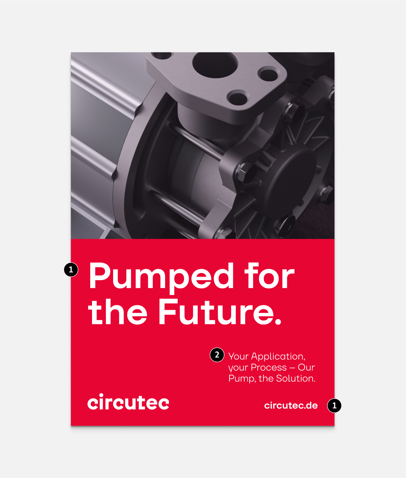
TT Firs Neue is used in mixed form. Headlines appear particularly prominent with a generous white space. They are significantly larger than sublines und copytexts to ensure that information hierarchies are structured clearly and legibly.
1
Use of TT Firs Neue Demi Bold
Headlines and URLs always appear in the style Demi Bold. This can also be used for smaller subheadings or highlighting in the copy area.
2
Use of TT Firs Neue Regular
Copytexts and sublines appear in Regular font.

Alternative font
An alternative font to TT Firs Neue may be used if this can not be used for technical, license- or content-related reasons. This font is the sans serif font Verdana, which is supplied with operating systems or software and is available at no extra cost. It is used in the styles Regular and Bold. The font is used in the same way as TT Firs Neue.
When using Verdana in headline sizes, it is only important to ensure a slightly increased line spacing.
On Linux devices, the DejaVu font is used as a fallback, as Verdana is not available.


FAQ
In our FAQ area, you will find answers to the most important questions relating to the implementation of our brand guidelines. Here you will receive fast and practical support for a consistent brand communication.
The main font used for our brand is TT Firs Neue, which is used for headlines, sublines and copytexts. This font was chosen to communicate the visual identity of our brand in a clear and modern way.
Semibold is used for headlines and important highlighting, such as for emphasizing URLs. Regular is usually used for all other texts.
If the corporate typeface is not available, Verdana can be used as an alternative. This font was defined as an alternative to maintain consistency with the brand identity even in exceptional cases.
For Linux devices, the DejaVu font is used because Verdana is not available by default.