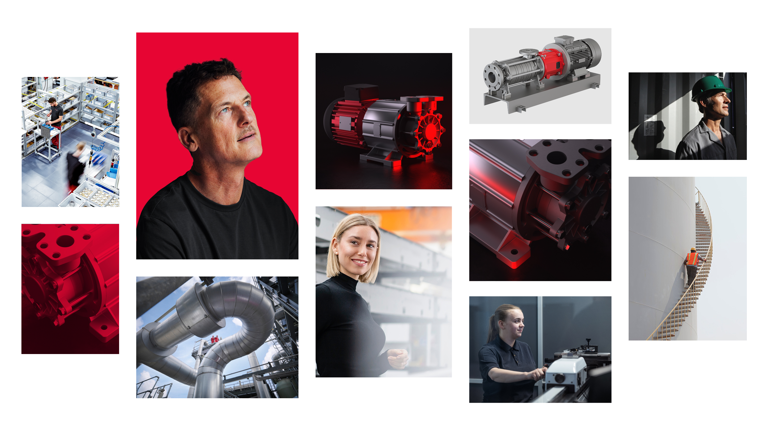
Visual language
The visual language of Circutec is clear, high quality and characterizes the brand. It transports values, ensures brand recognition and supports the content message in every medium. Different image styles enable flexible, yet consistent staging - coordinated with the context, target group and use.
Product image
Circutec puts the product in focus.
Different image styles are used depending on the area of use – from factual and technical to expressive and emotional. Design elements such as image detail, perspective, lighting direction and the targeted use of red support a clear image effect in line with the brand. The differentiated visual language ensures a high recognition value and enables versatile staging of the products to suit the situation.
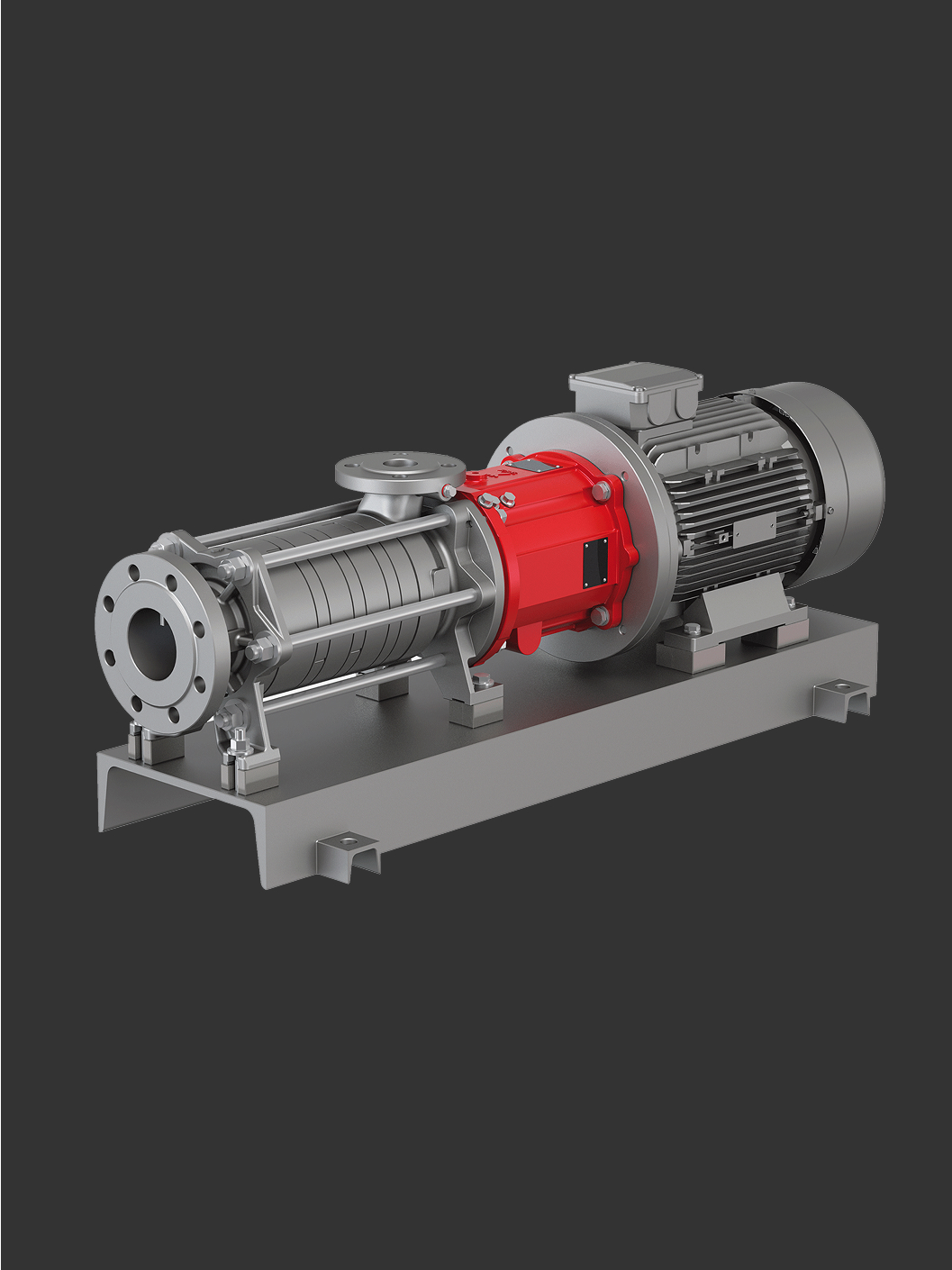
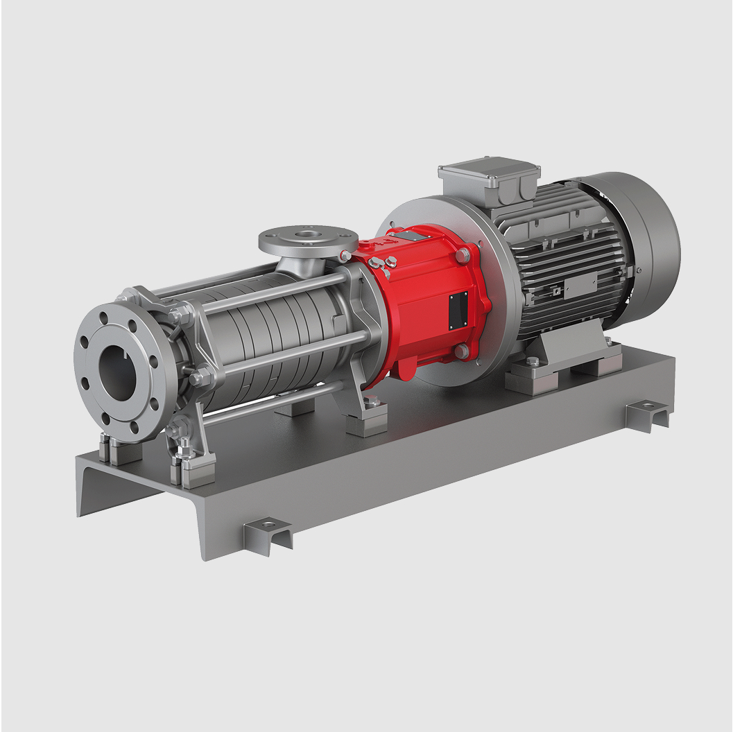
Technical views
If we want to portray our products in a concrete and factual way, we use a precise, technically clean portrayal which places the focus on the function and on the design.
The product image appears isolated on the structuring colors, red, white or black.
We take care to ensure balanced illumination, authentic materials and a consistent scale.
Different perspectives can be used in a targeted way to emphasize properties, functions or the design. The deliberate variation of perspective creates a varied and more visually exciting overall impression.
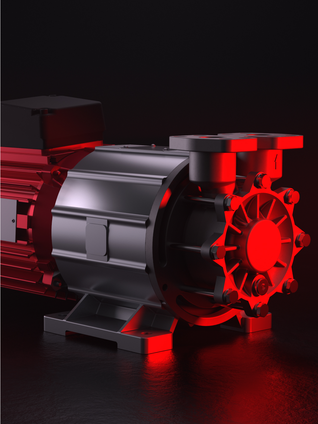
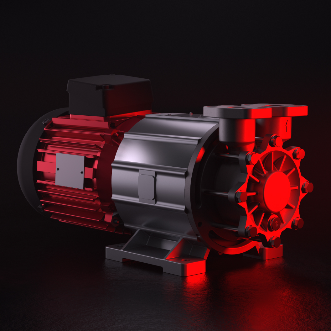
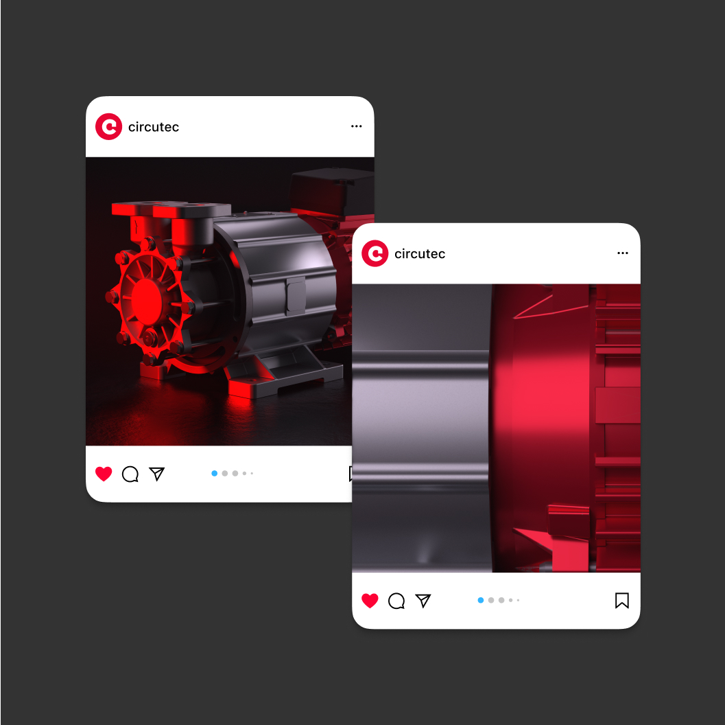
Hero motifs
Here, the focus is on the product – clearly staged and with red accents.
The red light gives the motif a powerful, emotional character and transports the technological, dynamic character of the Circutec brand.
The background is intentionally left reduced. Through targeted lighting direction and strong contrasts, a focused image with powerful radiance is created – ideal for key visuals, trade fair appearances or attention-grabbing communication media.
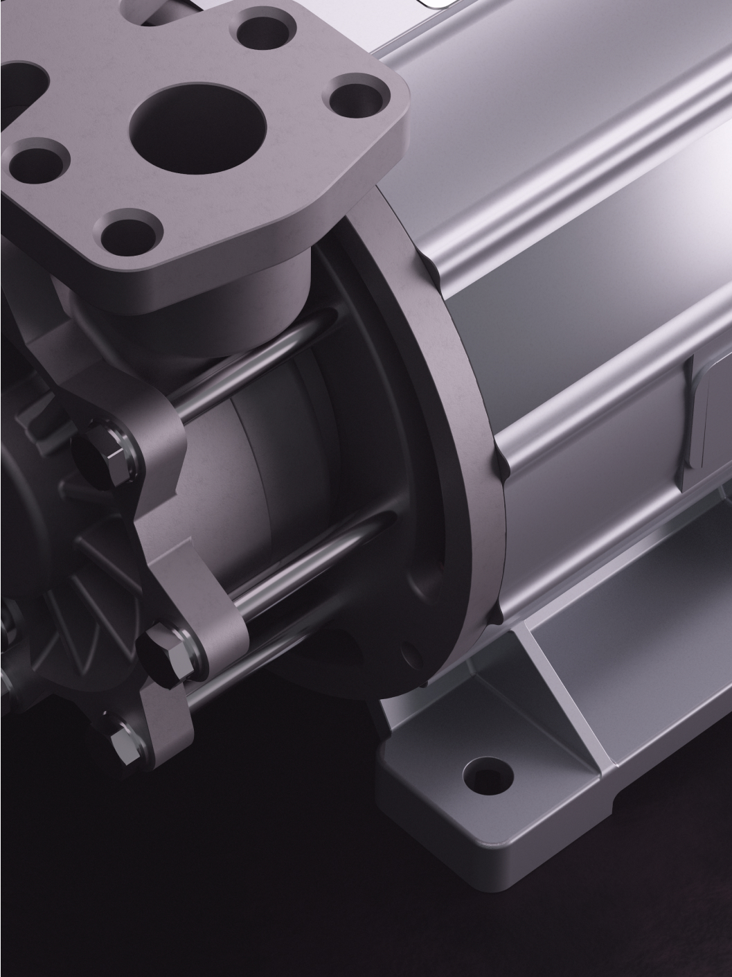
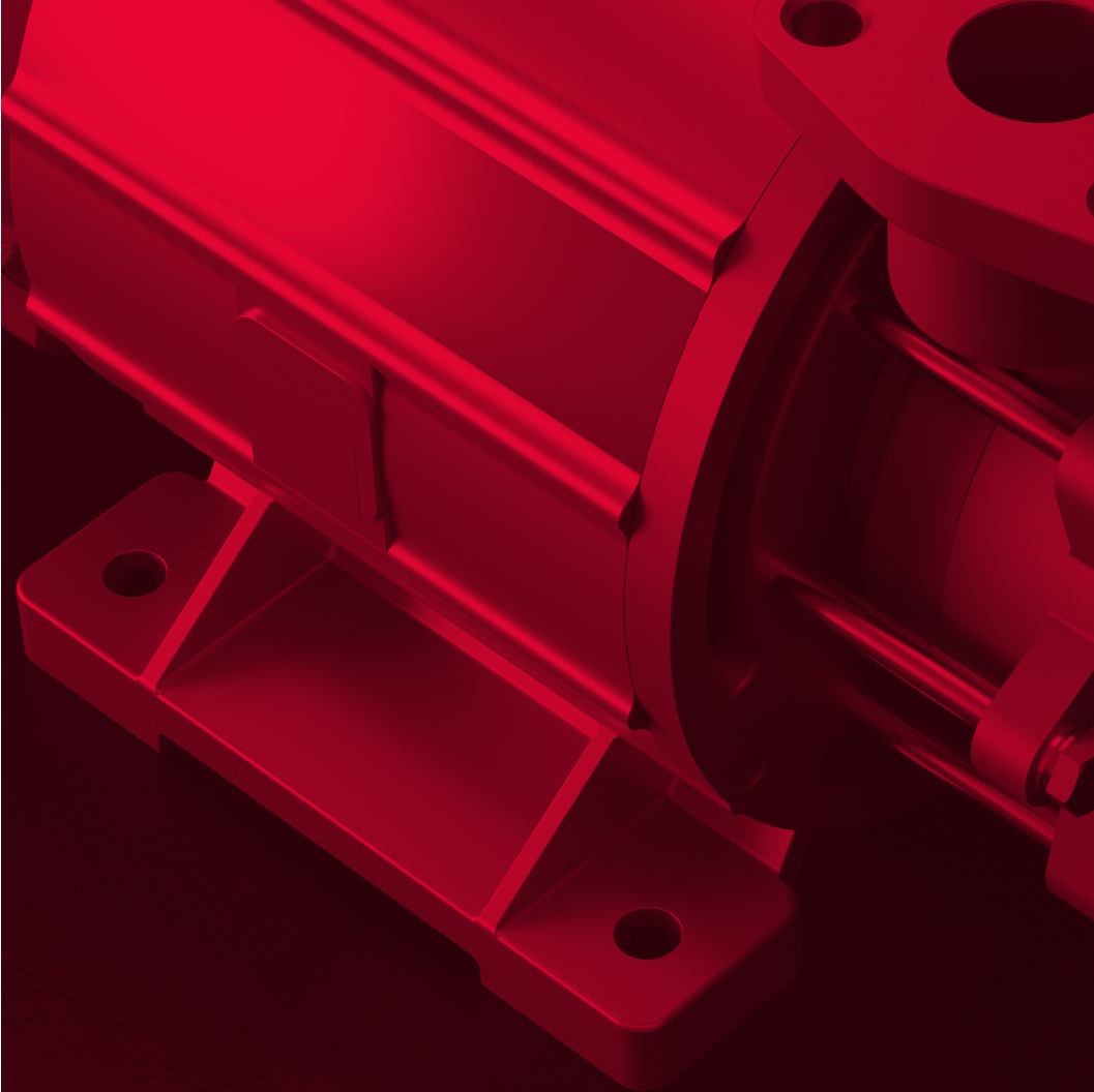
Detailed views
Detailed images show function, material and technical precision. They put functions, surfaces or components in focus – or appear almost abstract due to extreme close-up shots.
Macro-shots emphasize material and fine details and give the product a high-quality appearance.
Red proportion
Red is used in a targeted way to create different degrees of impact. In technical contexts, the use remains reduced and is limited to specific product details. For stronger staging, the product can be partially accentuated with red light. In expressive applications, red dominates as a stylistic design tool, for example through use as a fill coloring in duplex look.

Here, products are shown as they appear in reality.
The red proportion corresponds to the product and can be increased through targeted lighting.
For a maximum proportion of brand color, most images can be colored in red with a duplex effect.
Use of images
The interplay of perspective, image detail and the targeted use of red creates a broad range of design options when using product images. The combination of these tools opens up a wide range of options when staging products – from factual and technical to expressive and emotional – and enables viewers to experience the product visually in a wide range of contexts.
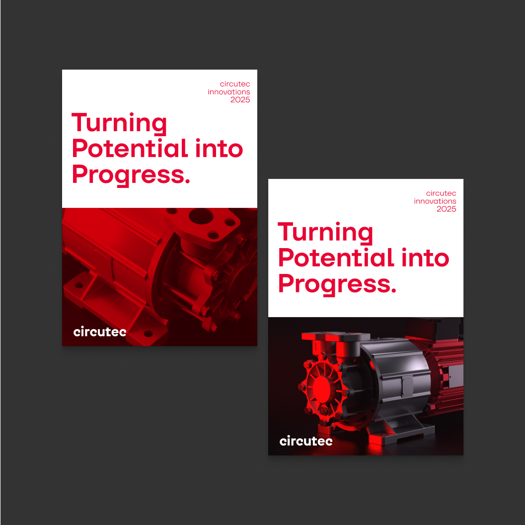
Image plane
Socials and advertisements
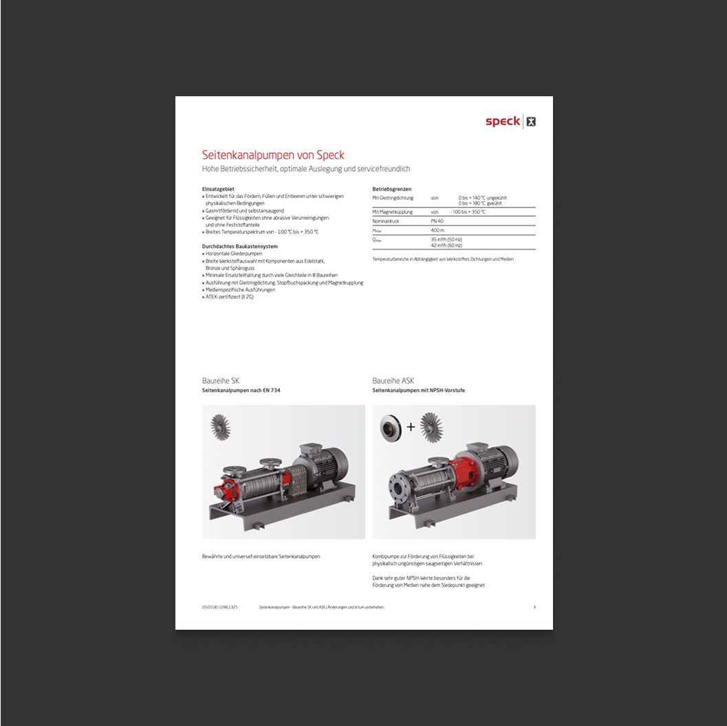
Content level – product catalog
Real image
The image composition follows clear principles: a balanced image structure, straight lines and calm areas.
Images have a natural, credible look. Color and lighting direction create a sense of authenticity and avoid excessive staging. Blurring and reflections are permitted and create more dynamic images. People are depicted as confident, serious, yet also approachable – always with an open, amenable expression. We use real life, unstaged situations that capture the moment honestly and enable viewers to experience the brand at their level.
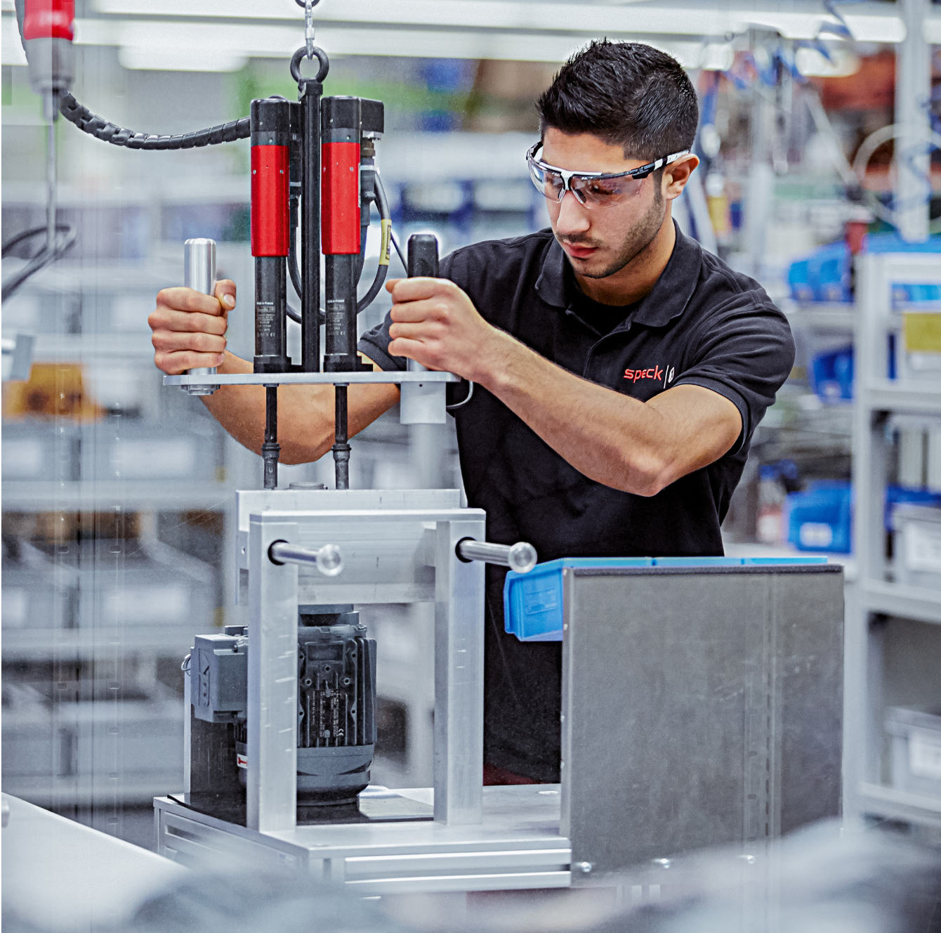
People working
We show ourselves and our employees at work. The images are accessible and unstaged, the focus is not on the camera, but on the work and the colleagues.

Portrait
People are depicted as confident, serious, yet also always approachable. Authentic, unstaged situations are shown, that capture the people in the moment.
A confident and friendly look into the camera is also possible.
Cut-outs
The use of cut-outs is also permitted and enables clear use of the brand color.
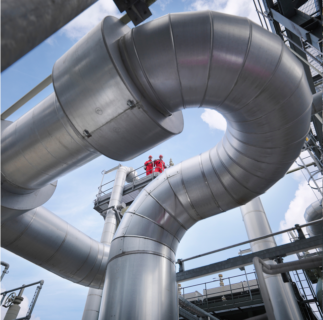
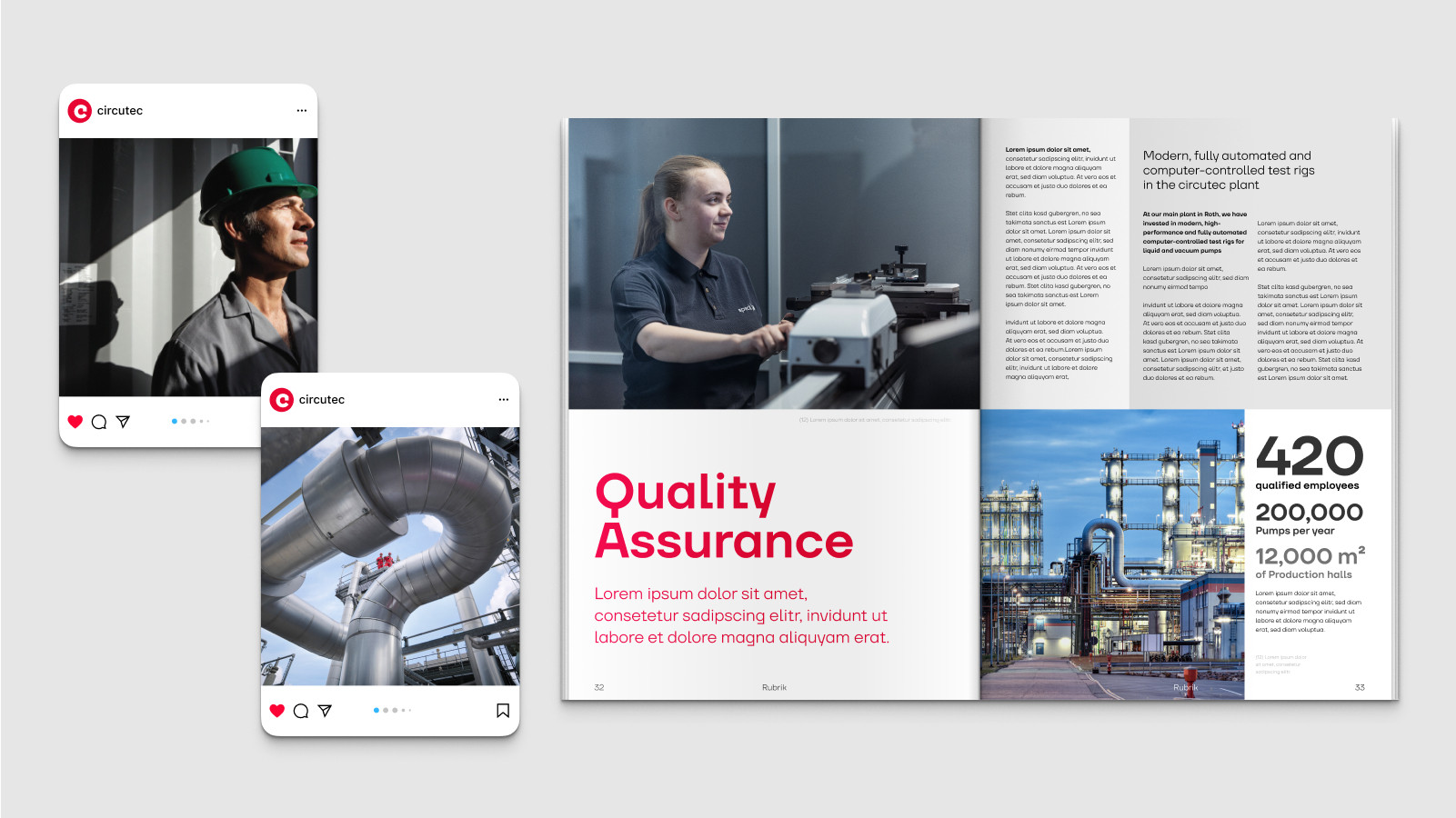
Reports
The focus here is on processes. People can play a role, but are not the focus of the image. Exciting shots and perspectives create striking images. Motion blurring is permitted and makes processes visible.
Image style checklist
Style
Clear image structure
Calm background through blurring
Focus on a central image conten
Approachable and in action
Color coordination
Natural and warm coloring and lighting
Bright and inviting
Natural color temperature
Balanced color saturation
Even illumination
Contrast
Balanced contrast ratio
Clarity in heights and depths
Full tonal range
Perspective
Natural perspective
Straight lines
Undistorted display of objects
Use of images
Correct use in different media.
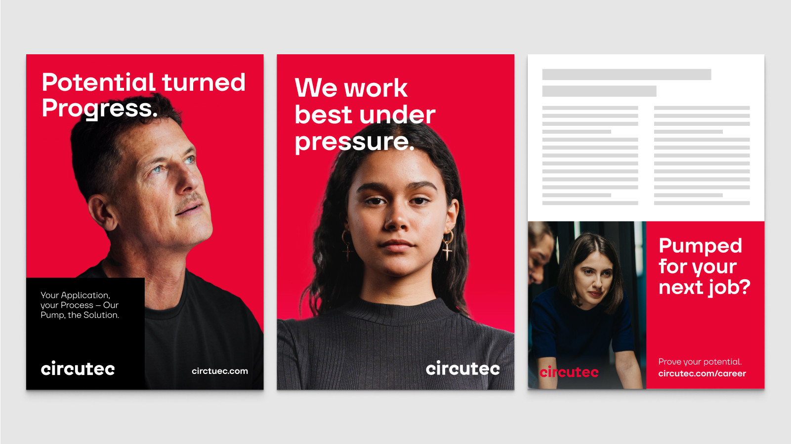
Image level
Content level
FAQ
In our FAQ area, you will find answers to the most important questions relating to the implementation of our brand guidelines. Here you will receive fast and practical support for a consistent brand communication.
Yes, but only if they correspond to our image guidelines. Stock photos should be high quality and authentic and must not show stereotypical or staged scenes.
Images should show clear, focused motifs and offer lots of space around the central element.
People should always be portrayed as authentic, approachable and in everyday situations. We want to show realistic scenarios that appeal to our target groups.